Case Study: Redesigning a Text-to-Speech Voice Building & Evaluation Platform
What
I redesigned an existing text-to-speech (TTS) platform used to build and evaluate synthetic voices, working within Amazon.
The process had three phases:
Research: define the problem, talk with users, review the competition.
Product concept: hand-drawn ideas, low- and high-fidelity wireframes, customer testing.
Design: analyse the current platform, define the information architecture and user flow.
1. Research
The existing TTS platform was outdated and full of unnecessary functionality, so most people worked around it with their own documentation. I interviewed people in three roles who work with synthetic voices:
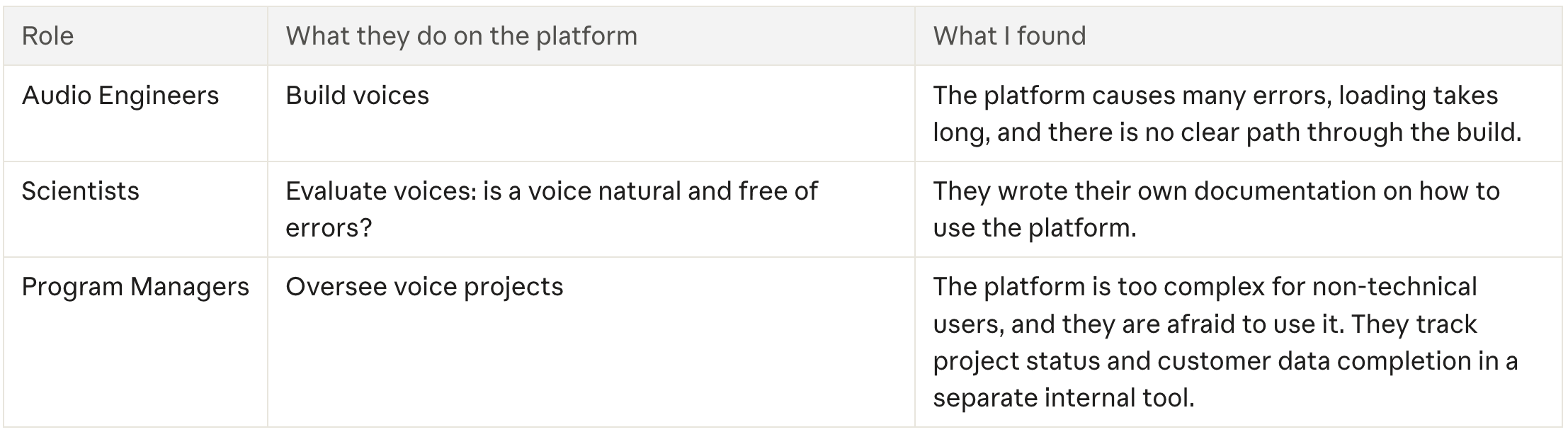
When it comes to building voices, users don't know which parameters to use and mostly rely on their own notes. Existing surveys also showed that the platform lacks basic accessibility, such as keyboard navigation.
Problem
An outdated TTS platform with many unnecessary functions that users avoid, especially Program Managers.
Design goals
Demonstrate credibility.
Create an appealing, minimalistic product: improve the visual design, but only where it supports usability.
Keep access to primary tasks.
Iterative prototype testing
We tested design prototypes extensively before writing any code. From an early stage we involved users in the new product and asked many questions. We started with low-fidelity, black-and-white wireframes for content planning, then moved to high-fidelity prototypes before any customer testing.
2. Product Concept
What we call a Project
A Project is the place where all information about a voice is stored: relevant dates, owner, evaluations, number of voice builds and so on. To build a TTS voice, a user needs to choose a build technology and an evaluation.
After a lot of brainstorming we decided the Project would be the main place for every user group. Inside it sit voice builds and evaluations. At first we split them into two tables (Voice Builds and Evaluations), but we finally merged them under one new name: Workflows.
Making "New Workflow" easy to find
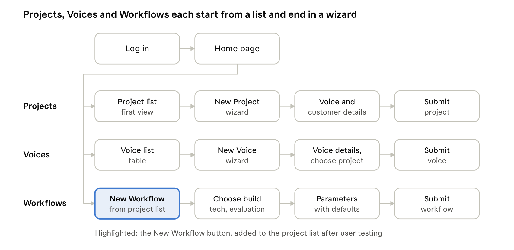
After the first round of user testing I found that users couldn't tell where to add a new workflow, and the path to it was too long. I added a "New Workflow" button to the project list, which is the first view after logging in. Users pick a project, then add a workflow to it.
Voices
I used the same concept for voices: a voice list with a table and the buttons "New Project" and "New Voice". Users can add a new voice to a chosen project, add a new project, or both. Clicking "New Project" opens a wizard that includes choosing a voice for the project.
Parameters for build technology and evaluations
The next problem from the interviews was the parameters for build technology and evaluations. Users rely on previous parameters that worked well and are careful with new values, and they don't know exactly what each parameter stands for.
So I moved parameters into the final step after adding a new workflow. Build technology and evaluations each have an expandable section. Users can edit the parameters or leave them alone, because every parameter has a default value. Advanced users can dig deeper into the details.
3. Design
While designing the concept I used Amazon's design system to keep the platform consistent. The information architecture below shows how the solved problem fits together.